Styling Listings
Audience:
UI Designers,Power Users,App BuildersSkill Prerequisites:
Basic CSS,Understanding of TokensAvailable beginning in version 1.27 as a hotfix
Plant an App Listings offer powerful styling controls, enabling highly dynamic, conditional formatting for your views (Data Table, Cards, Calendar) directly through the configuration UI. This empowers both low-code and pro-code builders to create visually rich, status-aware, and user-friendly listings—without requiring custom templates or extensive scripting.
Typical Use Cases
- Conditional Row Styling: Color an entire row by "Status", "Priority", or any field—for example, highlight overdue or critical items automatically.
- Context-Aware Cards: Easily differentiate card backgrounds based on Owner, Status, or any meta-data, helping users visually scan and identify key items.
- Calendar Event Highlighting: Color-code calendar events based on type or urgency, e.g., all "Critical" tasks appear red, "Meeting" events appear blue.
- Cell-level Emphasis: Make specific cells in a table "pop" based on values (e.g., negative financial values bolded or colored), or highlight columns based on the information type.
- Accessible UI: Add CSS classes for high-contrast mode, custom font sizes, or to integrate custom icons, tooltips, or graphical enhancements.
- Token-based dynamic classes: Automatically generate unique class names using field values for granular control (e.g.,
status-[Status],owner-[CreatedBy]).
Don't Use It To
- Apply arbitrary inline styles directly—this feature assigns classes, not styles. You must define your classes in the portal or page CSS.
- Substitute for server-side or backend validation logic.
- Style views other than Data Table, Card, or Calendar (other views are currently not supported).
- Use highly complex JavaScript-based behaviors.
- Add classes to arbitrary, unrelated DOM elements.
Input Parameter Reference
The following fields and settings enable styling in Listings. (Accessible in Listing View and Field Settings under their respective configuration panels.)
| Parameter | Description | Supports Tokens | Default | Required |
|---|---|---|---|---|
| Row CSS Class / Card CSS Class / Event CSS Class | Dynamic CSS class name(s) assigned to each row (Data Table), card (Card View), or event (Calendar). Accepts tokens, including item/field tokens. | Yes | "" | No |
| Label CSS Class | Applies CSS class(es) to the label/header of a field (column header in table, label in card/sidebar). Accepts tokens (but item tokens only for rows, not table headers). | Yes | "" | No |
| Field CSS Class | Applies CSS class(es) to the content of a field (cell in table, field content in card/sidebar). Accepts tokens including item/field tokens. | Yes | "" | No |
Different Sections
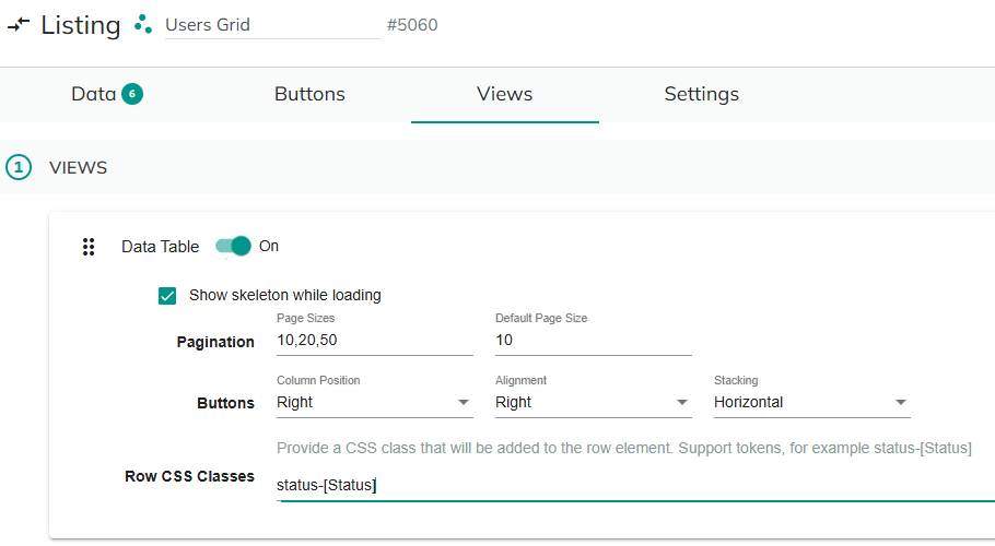
View-Level Styling Configuration
Data Table view:
- Row CSS Classes: Dynamically assigned to each
<tr>. - Field Settings:
- Label CSS Class: Applied to respective
<th>(note: only global tokens or first row’s tokens are available due to how headers render). - Field CSS Class: Applied to each
<td>cell.
- Label CSS Class: Applied to respective
- Row CSS Classes: Dynamically assigned to each
Card View:
- Card CSS Classes: Assigned to the root
.card<div>. - Field Settings:
- Label CSS Class: Applied to
.field-headerin the card. - Field CSS Class: Applied to
.field-valueinside the card.
- Label CSS Class: Applied to
- Card CSS Classes: Assigned to the root
Calendar View:
- Event CSS Classes: Assigned to each event anchor element (
<a>) (for event rectangle). - Sidebar (event details panel):
- Label CSS Class: Applied to
.field-headerelement in event detail. - Field CSS Class: Applied to
.field-valuein sidebar.
- Label CSS Class: Applied to
- Event CSS Classes: Assigned to each event anchor element (
Tokenization Details
- All class inputs support Tokens—dynamic placeholders such as
[Status],[ID], etc. - When using tokens, Listing will generate class name(s) at render time. For example:
- Input:
status-[Status] - Output classes:
status-OnTime,status-Cancelled, etc.
- Input:
- For Data Table headers: Only global tokens are available.
- Spaces or special characters in token output will be replaced/cleaned for valid CSS class names. Inspect DOM if advanced class names are needed.
CSS Definitions
- You must define your class styles in your Portal CSS, Theme editor, or per-page CSS. The Listing module adds classes but does NOT generate any CSS style rules.
Examples
1. Conditional Row Styling by Status (Data Table)
Style all rows where status is "Overdue" with a red background:
CSS example:
.status-Overdue {
    background: #ffe5e5 !important;
}
2. Card View: Owner Coloring
Highlight card based on the owner:

CSS example:
.owner-admin { border: 2px solid orange; }
.owner-jdoe { border: 2px solid blue; }
3. Calendar Event: Priority Highlight
Assign event class based on priority token:

CSS example:
.priority-High { background: #f33 !important; }
.priority-Low { background: #3f3 !important; }
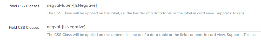
4. Table Cell Emphasis
Emphasize negative values. Note that this example will allow you to style the Labels and Fields of Cards and Calendar Items, but not the headers of a Data Table because the headers are not associated with a particular row.
CSS example:
.negval-True { font-weight: bold; color: red; }
.negval-label-True { font-weight: bold; color: red; }
Troubleshooting & Recommendations
- If styling does not appear, ensure the class you set is defined in your CSS.
- Use clear, predictable class names—avoid special characters in tokens.
- When inspecting Data Table headers, remember that item/row tokens usually cannot be used.
- Complex or conditional rendering that cannot be achieved with class tokens may require custom templates or JavaScript.
By leveraging styling in Listings, your apps gain significant flexibility in communicating status, context, and actionable data to users, all while keeping your configuration manageable and reusable.