Fields - Overview and settings
This page details the Field types and subtypes available in the Form Builder and provides information about how you can use them in your web form.
There are common parameters to all field subtypes as well as specific ones.
The Common Parameters (see below) are, as their name implies, are common to all Field types.
There are also common configuration sections that apply to all field subtypes. See Common configuration sections, below.
Finally, there are type-specific parameters; those are only applicable in the logic of each field type. Please see Type-specific parameters for more information on those.
Common Parameters
Those are the first parameters that you need to provide when creating or editing a Field and are common to all Field types. They are listed and explained below.
| Parameter | Description and information |
|---|---|
| Type | Allows you to define the type/subtype of the field. These are predefined field-types that help you to quickly add usual fields such as addresses, dates, usernames, etc., as well as predefining the data format that is expected in each field and thus avoid Form validation errors. |
| Title | The field's title that will be displayed directly on the Form. This area supports tokens but impacts the "ID" (see below). |
| ID | Works in conjunction with the "Title" (see above). By default, the ID for each new field is created here and can be used to reference each field by using the "[ID]" syntax. You can disable the automatic ID creation by unchecking the adjacent "Auto" box. This allows you to use tokens in the "Title" area. |
| Show Conditionally | Show or hide this field according to the evaluation of a boolean expression, at the Form page loading stage. Note that you can also achieve this dynamically (show/hide this field according to local user actions, after the page is loaded) by altering the "Show" field in the "Bind Expressions" section (see below). |
| Enable Conditionally | Enable or disable this field according to the evaluation of a boolean expression, at the Form page loading stage. Note that you can also achieve this dynamically (enable/disable this field according to local user actions, after the page is loaded) by altering the "Enable" field in the "Bind Expressions" section (see below). |
| Short Description | Free text area to describe the use of the field. Note that this can be displayed to the user as well, by checking the "Show Tooltips" option in the Settings > Advanced Settings section. |
| Custom Attributes | You can add custom HTML attributes to be inserted onto the field's HTML tag (input,select,etc.) and can be used by javascript libraries or CSS. You can add as many custom attributes as you want; you can remove them individually by cliking the adjacent "🗑" (trash can) icon. |
| Other Options | Enable - on/off switch that allows you to enable or disable the field statically.Disable auto complete - on/off switch that allows you to enable or disable the autocomplete feature for this field. |
As mentioned above, "Show Conditionally" and "Enable Conditionally" are applied on the server side, support C# syntax and are not executed in real time. They are evaluated on Form load and on button clicks. However, they give you access to all your general Tokens.
Common Configuration sections (Bind Expressions, UI Settings, Validation)
These sections or configuration attributes are common to all field subtypes and buttons. They are to be found in the lower part of the field or button editor (the Field or Button must be expanded) and are expendable by clicking on their title bar (or "+" sign).
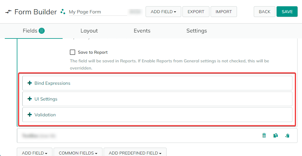
See below for a list and information about each of them.
Bind Expressions
This section allows you to dynamically define the behavior of fields according to the local attributes and settings of the user that accesses the Form (i.e. they are executed on the client side). These parameters are evaluated in real time and not just in a static context - as is the case with the "Common Parameters", above.
As such, you can show or hide fields, enable or disable them, automatically assign values to them or define a specific behavior when the value in this field changes or when a button is clicked.
This is very useful when you want to show and apply different Form settings according to a local user type for example.
| Parameter | Description and information |
|---|---|
| Show | Dynamically show or hide this field according to the evaluation of a boolean expression. For example, show the credit card field only when the relevant payment method is selected: [PaymentMethod] == 'CreditCard'. Note: you can achieve a similar result statically, at the Form page loading stage via the "Show Conditionally" parameter (see the " Common Parameters" section above). |
| Enable | Dynamically enable or disable this field according to the evaluation of a boolean expression. For example, enable the credit card field only when the relevant payment method is selected: [PaymentMethod] == 'CreditCard'. Note: you can achieve a similar result statically, at the Form page loading stage via the "Enable Conditionally" parameter (see the " Common Parameters" section above). |
| Preserve Layout | Enable this option to preserve the visual layout of the Form when fields are disabled/hidden by using the two options above. |
| Value | Dynamically compute the value of this field. So when other fields change this fields updates automatically. Use standard javascript operators where needed (+, -, *, /). For example, use [FirstName] + ' ' + [LastName] to automatically fill the "Display Name" field. Note that once the value is edited manually, the automatic synchronization stops. |
| On Change/Click | Define re-evaluation behavior to bind some code to be executed when a button is clicked or a field value changes. This allows for more advanced scenarios compared to the other bindings and you can use the full JavaScript capabilities, including conditions, loops and other capabilities. Since |
Reference fields by their token syntax, for example [FirstName]. If you want to evaluate your tokens against a boolean value, for example [TextBox]=="True", please take into consideration the fact that the values inside the token will be replaced with the JavaScript boolean values. Because of this, the correct syntax to evaluate against a boolean value is [TextBox]==true / [TextBox]==false.
As mentioned above, "Show" and "Enable" apply on the client side, through JavaScript and Angular JS and are evaluated in real time. They do not give you access to server-side objects such as general Tokens but they allow you to show/hide or enable/disable fields based on values present in other fields.
Bind-type expressions are JavaScript code (Angular JS), so the Tokens translate to JavaScript variables which are bound to form fields. So when a form field changes so does the variable changes - and vice versa. That’s how all binding libraries, including Angular JS, work. However, general Tokens run on server side.
UI Settings
Here you can define specific CSS Classes or Styles to customize the Labels and Controls (i.e. data-entering fields) of this particular Field.
| Parameter | Description and information |
|---|---|
| Label CSS Classes | Allows you to define specific CSS classes to style the label(s) in this Field. |
| Control CSS Classes | Allows you to define specific CSS classes to style the control(s) (the fields that will require input from the user) in this Field. |
| Styles | Additional CSS styles to apply to the Label(s) or Control(s). You can learn more about CSS Styles, here. |
The two "Classes" fields and corresponding "Style" fields work independently. For example, you can use a CSS class that you can alter with specific Styles for this particular use case, or you can simply define Styles (and no Class(es)) to be applied to the default display template.
All fields in this section support Tokens.
Validation
Set validation parameters for the fields in your form. This will require the data that is entered to follow specific formatting rules. This is useful for defining the data format provided in "Text" type fields (see the subsequent Forms field types list > Text documentation page), that have no predefined formatting rules.
Since this section logic ties to the validation of data that needs to be provided/entered into a field, it only applies to Fields and is absent from the Buttons configuration.
| Parameter | Description and information |
|---|---|
| Condition | Here you can define a boolean expression (in C#) that will determine if the validation will execute. This is useful if you want to apply field validations under certain conditions only. A common example is [SomeField] == "Some Value" or [SomeField].IndexOf("something") == 0. If left empty, the validations will apply in all situations. This field supports Tokens. |
| Required | Check this box if you want to make the filling of this field mandatory. |
| Custom Validator #1 | Allows you to define a validator condition for the field. The format and character type content of the entered information will be checked and rejected if the "Required" option (see above) is checked. See below for a list of validators and their description. |
| Custom Validator #2 | Allows you to define a second validator condition for the field. This is useful when you want the data to fulfill two conditions - for example an e-mail address (1) that should only contain letters (2). See below for a list of validators and their description. |
| Group Validation | Allows you to arrange fields into "validation batches" and thus link their validation by groups. According to the option you choose (in parenthesis),one such group must have either have one validated field including non-required fields (At Least One Is Filled), at least one validated field not including non-required fields (At Least One Strictly Positive Integer) or must pass the validations for all its fields (Fill All). You can define up to 9 such validation groups on each Form. |
Validators list
This is a list of the regex validators you can verify the data that is entered against. They will check a specific format with predefined limitations.
| Validator | Validation condition |
|---|---|
AMEX Card Number | 5-digit long, with no alterations and spaced in three blocks of 4, 6 and 5 digits from left to right.: “3xxxxxxxxxxxxxx”. |
Credit Card Number | 13 to 19 numeric digits. |
Date US (mm/dd/yyyy) | Date in US-type format. |
Discover Card Number | Data begins with a "6" and has 16 digits, no spaces. |
Domain Validator | Domain format: "x.y", where x is between 1 and 64 alphanumeric characters long, and y is between 2 and 17 letters long. |
Email Address | Mail address format: "[..]@[..].[..]". |
Floating Point Number | Positive or negative whole number with a decimal point. |
Integer Number | Whole number (not a fractional). |
Letters Only | Accepts only letter characters (UTF-8). |
Master Card Number | Starts with 50, 51, 52, 53, 54 or 55 and is 16-digit long. |
No Whitespace | No spaces accepted. |
Password | Password input/definition validator; expects 7 or more alphanumeric characters. |
Phone (###) ###-#### | US-type phone format. |
Positive Floating Point Number | Positive whole number with a decimal point, including zero. |
Positive Integer Number | Positive integers, including zero. |
Strictly Positive Floating Point Number | Whole numbers with a decimal point, strictly greater than zero. |
Strictly Positive Integer Number | Integers, strictly greater than zero. |
Strip HTML | The Form validation will strip entered data of HTML tags. |
User exists (by email) | Checks if the user email address exists in the instance. |
Username is Available | Checks the availability of the username in the instance. |
Username is Available (excluding current user) | Checks the availability of the username in the instance and excludes the current user. |
Visa Card Number | 16-digit, starting with "4", no spaces. |
Web Address | Requires URL format-type input: "x.y", where x is at least one alphanumeric character long, and y is at least one letter long. |
After you Save your changes, make sure that you also hit the "🗘" (Refresh) button to be able to see them in the Form you've created/modified.
Note how the title bar of the Form of Button indicates through tags which of the common configuration elements are active for that element (also note that the "Validators" tag has a different color, since it only applies to Fields and not to Buttons):
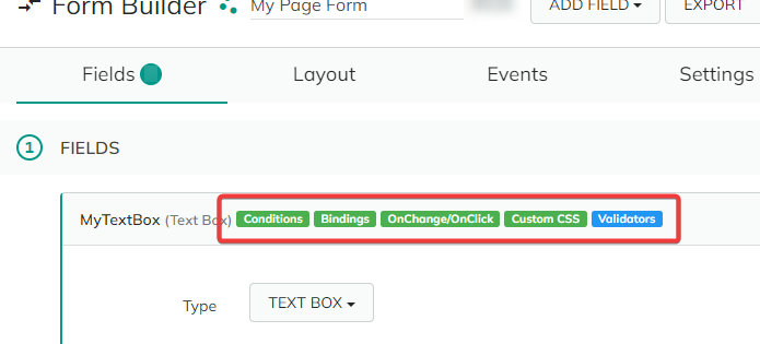
This allows you to see at a glance which configuration elements are active for that Form/Button, without needing to expand the element in question and the subsequent "Bind Expressions", "UI Settings" or "Validation" sections.
Also note that the Form Builder will automatically detect duplicate Fields and/or Fields with the same ID and will label them with the "Duplicate ID" tag.
ss forms-field-duplicate
Please make sure that you do not have duplicate ID Fields in your Form, as this could lead to display issues. Simply edit the "ID" field (see "Common Parameters") manually in order to have a unique ID for every Field on your Form.
Type-specific field parameters
To accelerate and ease the Form's creation, we've created specific, predefined fields, that correspond to usual data types that are used and required in forms. There are eleven such field types (Address, Date and Time, Buttons, Files, Graphics), each with their own subtypes:
Address- fields relating to address data, such as Country, Region, etc.Buttons- for the definition and settings of the buttons on your Form.Date and Time- fields relating to clocks and dates.Files- for file management and upload on the Form.Graphics- for graphic fields such as progress bars and images.Hidden Data- for submitting Form data that cannot be edited/entered by the user (the UserID for example).Multiple Choice- fields for which the entered data is a multiple-element choice from a list.Security- security fields such as CAPTCHA or passwords.Single Choice- fields for which the entered data is a single-element choice from a list.Text- text and integer values which do not fall under another category (currency, number, phone number) as well as free text; note that for the latter you can add validators - see "Validation" under the "Common Configuration sections" above.User- user-specific fields (email, username).
Those fields are type-specific, meaning that they have specific parameters that make sense only in a predefined context. For example, such parameters as "Date Format" or "First Day of the Week" only make sense for a Date and Time Picker field type.
For a complete list and information about those field types and their subtypes as well as their specific parameters, please see the subsequent page - "Fields: Types list".
Back to the top ⤴