Working with the Form Builder
The Form Builder interface is intuitive, highly configurable and ergonomically split into four sections that allow you to work your way through building your web Form easily and progressively.
The Form Builder has four configuration sections - check the list below for a brief description of each of them. More information can then be found lower in the page. Note that some sections have separate pages which provide extensive information and deep-dives.
- In the
Fieldssection you will define the various fields and buttons that will populate your web form page. - The
Layoutsection allows you to define the UI arrangement of the different fields and buttons that you've defined. - The
Eventssection will allow you to determine the various actions to be automatically triggered at specific stages, such as before the web form is loaded or when a certain tab is accessed or left. - Finally, in the
Settingssection you will be able to configure and tweak various advanced settings related to the UI and technical compatibility of your web form page.
Fields and Buttons
The Fields and Buttons are the basic building blocks of your web form. The Fields section allows you to define what information your web form requires, under which format, how to validate it, make it mandatory or not and many, many other aspects.
In the Buttons section you are able to define what buttons will appear on your Form, their appearance, when and how they will be displayed and so on. They are also included in this section as they are considered a clickable field and have (mostly) the same attributes as the fields.
Fields
There are multiple ways to create a Field:
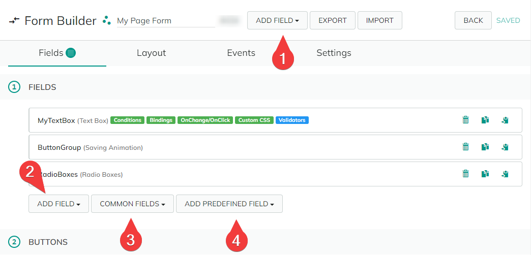
The
Add Fieldbutton allows you to see all the available Field (and Button) types and sub-types; note the "Search" functionality that will help you to quickly find the field type/subtype you are looking for.The
Add Fieldbutton is duplicated beneath your Fields list for ergonomic purposes.To further ease of access and to speed-up the Field creation process, you can click the
Common Fieldsbutton; that will give you a quick access to the most common Fields and Buttons types used in the Form creation (Dropdown list, Checkbox, Text Box, etc.).The
Add Predefined Fieldbutton gives you easy access to specific, predefined fields. Similar the the "Common Fields" button (above), it groups some commonly used fields but also custom "Text Box" type fields (free text) but with specific validators that will make them accept only predetermined data formats and types - such as Units, Websites, E-mail addresses and so on.
To edit an existing Field, simply click on its title bar to expand its properties.
Buttons
To create a Button on your Form, you can either click the Add Button button (creates a standard button) or via the Add Field button, by accessing the "Buttons" section; the latter allows you to create specific buttons: Button Group and Image Button (see the "Fields: Types list" page for more details).
Note that "Saving Animation" is actually a "Field" and will this be created in that specific section if selected.
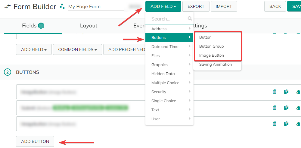
A "Submit" button that allows the Form to be submitted is created by default for each new Form.
To edit an existing Button, simply click on its title bar to expand its properties.
Element controls
You can "Delete", "Clone" and "Copy the ID field" of your Fields and Buttons in one click via the buttons on the right-hand side of their title bar.
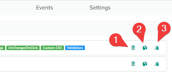
Delete- Select the element for deletion/removal. Note that it will not actually be deleted until you do not click the "Save" button (upper-right corner of the "Forms Builder" window).Clone field- Allows you to automatically make an identical copy of the Form or Button in question. Note that the name of the copied element will be automatically generated as: "<name of your original element>Copy".Copy field as ID token- Automatically copies the "ID" field from the Field or Button. This allows you to easily use it as a Token in another context.
After you Save your changes, make sure that you also hit the "🗘" (Refresh) button to be able to see them in the Form you've created/modified.
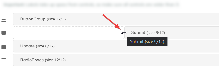
Layout
Here you can arrange on your form page the Fields and Buttons that you've defined on the Fields tab (see above). This is a drag-and-drop type interface that you control with your mouse.
- You can modify the vertical order of each item by clicking and holding the "hamburger" button corresponding to it (left side), and then dragging it to the desired spot.
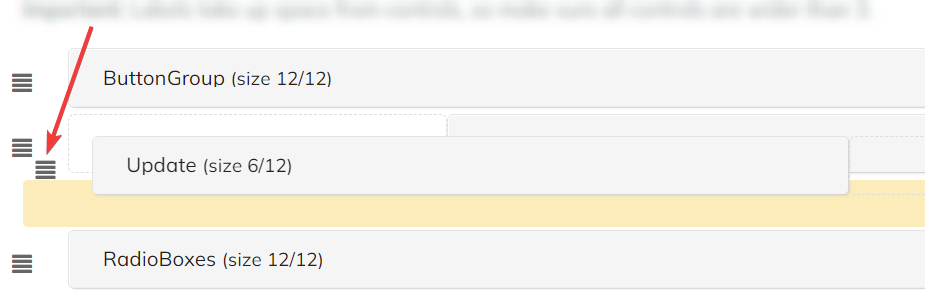
- You can set the horizontal size of each element by clicking and holding one of its horizontal limits (left or right) and dragging it until it reaches the desired size.
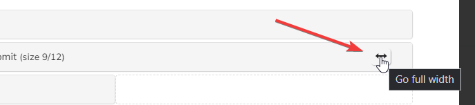
You can also make an item as wide as its present row in one click via the "↔" (Go full width) button.
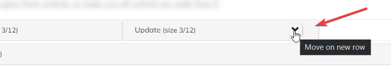
Finally, if you have more than one item per line, you can directly send an element to a new row by clicking the "ᐯ" (Down) button.
- The underlying design layer has a 12-column grid layout for each row, as indicated in parenthesis for each element. The size and position will snap to the grid.
- Element labels take up space from controls. Make sure that all controls are wider than 3.
After you Save your changes, make sure that you also hit the "🗘" (Refresh) button to be able to see them in the Form you've created/modified.
Events
This tab allows you to define what happens when the form is successfully submitted by the user. Each Event has different actions, each offering specific functions such as email notifications, user registration, SQL queries, and so on.
The various Event actions that you want to define are split into six categories that will trigger at various stages of the Form loading or submission process.
On Page Load- define actions to be executed when the page is loaded.On Preinit- define what happens before form fields get initialized.On Init- define what happens after the form fields have been initialized with a value.On Submit- what happens upon from submission (this is now defined for each individual button - seeButtonssection).On Validation Failed- defines a list of actions to be executed when validation fails.Tab events- actions upon accessing/leaving a form tab.
For a reminder about the various successive stages of how the Form data is loaded and executed on your web Form, please see the "Stages of Data Load and Execution" section on the "Forms: Overview" page.
Since the Events are action based, you can load an action from the Actions library (see the Actions section).
More details about these options can be found in the "Forms: Events" page.
Settings
In this section you can finetune interface parameters and define advanced and compatibility settings relating to your form. Please see the "Form: Settings" page in this section for detailed information.
Back to the top ⤴