Single Choice
An array of field types for single choice or single input to insert into your Form:
- Checkbox
- Color Picker
- Dropdown
- Dropdown with Autocomplete
- Item Picker (tree view)
- Radio Boxes
- Slider
- Star Rating
- Likert Scale (Agree/Disagree) (Obsolete)
- Likert Scale (Frequency) (Obsolete)
- Likert Scale (Importance) (Obsolete)
- Pages from Current Portal (Obsolete)
- Portals (except Portal 0) (Obsolete)
- Portals Dropdown (all) (Obsolete)
Note that only the field-specific parameters will be listed below. Please see here for a list of common parameters to all fields and here for the common configuration elements to all fields.
Checkbox
Allows the insertion of a single checkbox to the Form.
- Specific parameters
| Field | Description and information |
|---|---|
| Initially Checked | Determines whether this field will load initially checked. Possible values are True/False. Supports Tokens so you can pull data from various sources such as user profile. |
| Toggle Switch | Check this to transform the checkbox into a toggle switch. |
| Save to Report | Checking this box automatically saves the value from this Field into the database, under the avtActionForm_Reports table. |
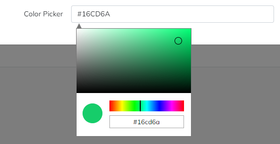
Color Picker
The color picker field allows a color to be selected via a JavaScript popup. A color picker is used to select and adjust color values.
- Specific parameters
| Field | Description and information |
|---|---|
| Initial Value | Set the initial value of the color picker in hexadecimal form: a hash (#) followed by six numbers (0 to 9) or letters (A to F). Please see here for more information oh hex color codes. Can also be left empty. |
| Save to Report | Checking this box automatically saves the value from this Field into the database, under the avtActionForm_Reports table. |
| Readonly | Checking this box will make the hex color code box read-only; in other words, the color picking action can be achieved solely through the the visual canvas. |
Dropdown
Presents a dropdown to the users, with the list being populated by a datasource.
- Specific parameters
| Field | Description and information |
|---|---|
| Link To | Link this to another multi-select field that, when changed, will cause this control to update with different items. For example, imagine a "Category" and "Subcategory" selection; when using this option, prefix each item below with the name of the parent category: “Value Of Parent Item/This Item”. Note: when linking to another field and using the " Items" Data Source (see adjacent page), if any part of the text or value of the options in the field includes a forward slash ("/") character, that character must be escaped by using a back slash ("\"). For example, if one of your items is "Type of Answer/Yes/No/Maybe", you should enter it in your items list as: "Type of Answer/Yes\/No\/Maybe" |
| Title When No Selection | The default text that appears in the Dropbox field before it is being clicked. For example: "Please select". |
| Datasource | Choose from existing data sources (see adjacent page) or provide values into the field (one per line). If you need to provide different Text and Value items, separate them by a pipe ("|"). Supports Tokens. |
| Initially Selected | The fields load initially having an initial value. Supports My Tokens so you can pull data from various sources such as user profile. |
| "Other" Option | Allows you to define an "Other" option at the end of the Dropdown list; if it is selected by the user, a textbox where data can be typed will be displayed. |
| Save to Report | Checking this box automatically saves the value from this Field into the database, under the avtActionForm_Reports table. |
Dropdown with Autocomplete
Presents a field with a dropdown list that enables users to quickly find and select from a pre-populated list of values as they type, leveraging searching and filtering.
The Dropdown with Autocomplete field provides suggestions while you type into the field.
- Specific parameters
| Field | Description and information |
|---|---|
| Link To | Link this to another multi-select field that, when changed, will cause this control to update with different items. For example, imagine a "Category" and "Subcategory" selection; when using this option, prefix each item below with the name of the parent category: “Value Of Parent Item/This Item”. Note: when linking to another field and using the " Items" Data Source (see adjacent page), if any part of the text or value of the options in the field includes a forward slash ("/") character, that character must be escaped by using a back slash ("\"). For example, if one of your items is "Type of Answer/Yes/No/Maybe", you should enter it in your items list as: "Type of Answer/Yes\/No\/Maybe" |
| Datasource | Choose from existing data sources (see adjacent page) or provide values into the field (one per line). If you need to provide different Text and Value items, separate them by a pipe ("|"). Supports Tokens. |
| Initially Selected | The fields load initially having an initial value. Supports My Tokens so you can pull data from various sources such as user profile. |
| Message for no results | Message to be displayed when no result is found on the list (when typing). Supports HTML code and Tokens. |
| Number of items | The number of elements initially displayed after a search. On scroll, more elements matching the search term will be displayed (default: 50). Supports Tokens so you can pull data from various sources such as user profile. |
| Disable dropdown on click | If checked, the dropdown will only appear when you start typing. |
| Save to Report | Checking this box automatically saves the value from this Field into the database, under the avtActionForm_Reports table. |
Item Picker (tree view)
Similar to the Dropdown list, this field will display at once all the list of items it holds when clicked on.
- Specific parameters
| Field | Description and information |
|---|---|
| Show Inline | When checked, will display the full list of items without needing to click on the field (useful if the list of items is not too long). |
| Datasource | Choose from existing data sources (see adjacent page) or provide values into the field (one per line). If you need to provide different Text and Value items, separate them by a pipe ("|"). Supports Tokens. |
| Initially Selected | The fields load initially having an initial value. Supports My Tokens so you can pull data from various sources such as user profile. |
| Save to Report | Checking this box automatically saves the value from this Field into the database, under the avtActionForm_Reports table. |
Radio Boxes
Will display the available options as Radio Buttons - graphical controls that allow the selection of only one item.
- Specific parameters
| Field | Description and information |
|---|---|
| Display Horizontally | If checked, will display the Radio Buttons on the same line, one next to the other (as opposed to a vertically-aligned list). |
| Link To | Link this to another multi-select field that, when changed, will cause this control to update with different items. For example, imagine a "Category" and "Subcategory" selection; when using this option, prefix each item below with the name of the parent category: “Value Of Parent Item/This Item”. Note: when linking to another field and using the " Items" Data Source (see adjacent page), if any part of the text or value of the options in the field includes a forward slash ("/") character, that character must be escaped by using a back slash ("\"). For example, if one of your items is "Type of Answer/Yes/No/Maybe", you should enter it in your items list as: "Type of Answer/Yes\/No\/Maybe" |
| Datasource | Choose from existing data sources (see adjacent page) or provide values into the field (one per line). If you need to provide different Text and Value items, separate them by a pipe ("|"). Supports Tokens. |
| Radio Buttons | If checked, will display the Radio Buttons as large buttons that contain their respective Text label (if left unchecked, the Radio Buttons will be displayed as Text labels preceded by selectable circles). |
| Radio Buttons styles | - Will only be displayed if the "Radio Buttons" option above is checked. Stylizes the radio buttons using CSS. It supports multiple CSS attributes separated by semicolon (e.g.: border:2px groove; border-radius:25px; color:#e42f43; font-family:Georgia). |
| Word between buttons | - Will only be displayed if the "Radio Buttons" option above is checked. Displays a text between the Radio Buttons. |
| Word styles | - Will only be displayed if the "Radio Buttons" option above is checked. Stylizes the word beetween buttons using CSS. It supports multiple CSS attributes separated by semicolon (e.g.: color:#e42f43; font-family:Georgia). Accepts the font-size only in px. |
| Initially Checked | Determines which of the check boxes are initially selected. Possible values are the ones from the Item list. Separate multiple values with semicolon (";") characters. Supports Tokens so you can pull data from various sources such as a user profile. |
| Save to Report | Checking this box automatically saves the value from this Field into the database, under the avtActionForm_Reports table. |
Slider
The Slider Field allows users to slide through the values of an array. It offers dual handles, floating point values, text/label/select output.
On submit, it will generate the following tokens: [<FieldName>] (which yields the value), [<FieldName>:StartValue], [<FieldName>:EndValue].
- Specific parameters
| Field | Description and information |
|---|---|
| Initial Value | Determines which value or interval (e.g.: 10, 20) is initially selected. Also sets the number of slider handles, either 1 or 2. Supports Tokens. |
| Start Text | Displays the initial value/text of the slider and therefore the position of the first handle. Supports Tokens. |
| End Text | Displays the highest value/text of the slider. Supports Tokens. |
| Help Text | Description of the option; appears beneath the handler. Supports Tokens. |
| Min Value | Value setting the minimum slider value. Supports Tokens. |
| Max Value | Value setting the maximum slider value. Supports Tokens. |
| Step Value | Value setting the slider step value. Supports Tokens. |
| Slider Captions | Append Slider Captions. Supports Tokens. Use “ .” for decimals.Usage example: One (Name) - 1 (Value), Two (Name) - 2 (Value), etc. |
| Slider Caption Classes | Append Slider Caption CSS Classes. Supports tokens. Usage example: label label-danger (Class Name) - 1 (Value), label label-success (Class Name) - 2 (Value), etc. |
| Width | Determines the slider width in px, em or percentage. |
| Display Tooltip | If checked, displays the tooltip with the current value. Note: only works with Bootsrap 3 templates. |
| Slider Orientation | Sets the orientation (horizontal, vertical) of the slider. |
| Save to Report | Checking this box automatically saves the value from this Field into the database, under the avtActionForm_Reports table. |
Star Rating
This field helps you collect and display user ratings on a star-type scale.

- Specific parameters
| Field | Description and information |
|---|---|
| Initial Value | The fields loads initially having this value. Supports Tokens so you can pull data from various sources such as user profile. |
| Number Of Stars | Select the number of stars in the scale (default: five). |
| Step | Choose the incremental rating step. Supported step count: 0.1, 0.5 or 1). |
| Size | Enter the star size. Supported sizes:xs - extra smallsm - smallmd - mediumlg - largexl- extra large |
| Minimum Rating (OBSOLETE) | This parameter has been marked as obsolete and will be removed soon (it will default to 0). |
| Maximum Rating (OBSOLETE) | This parameter has been marked as obsolete and will be removed soon (it will default to 0). |
| Selected Star Color | Set the selected star/star portion color in hexadecimal form: a hash (#) followed by six numbers (0 to 9) or letters (A to F). Please see here for more information oh hex color codes. Can also be left empty (will default to standard colors). |
| Unselected Star Color | Set the unselected star/star portion color in hexadecimal form: a hash (#) followed by six numbers (0 to 9) or letters (A to F). Please see here for more information oh hex color codes. Can also be left empty (will default to standard colors). |
| Clear Caption | Caption to be shown when no selection is made. Supports tokens. |
| Star Captions | Append Star Captions. Supports Tokens. Use “ .” for decimals.Usage example: One (Name) - 1 (Value), Two (Name) - 2 (Value), etc. |
| Star Caption Classes | Append Slider Caption CSS Classes. Supports tokens. Usage example: label label-danger (Class Name) - 1 (Value), label label-success (Class Name) - 2 (Value), etc. |
| Hide Caption | If checked, the Caption will be hidden. |
| Hide Clear Button | If checked, will hide the "Clear" Caption. |
| Save to Report | Checking this box automatically saves the value from this Field into the database, under the avtActionForm_Reports table. |
Likert Scale (Agree/Disagree) (Obsolete)
This field type is obsolete and will be soon removed. Please use one of the fields above instead.
Likert Scale (Frequency) (Obsolete)
This field type is obsolete and will be soon removed. Please use one of the fields above instead.
Likert Scale (Importance) (Obsolete)
This field type is obsolete and will be soon removed. Please use one of the fields above instead.
Pages from Current Portal (Obsolete)
This field type is obsolete and will be soon removed. Please use one of the fields above instead.
Portals (except Portal 0) (Obsolete)
This field type is obsolete and will be soon removed. Please use one of the fields above instead.
Portals Dropdown (all) (Obsolete)
This field type is obsolete and will be soon removed. Please use one of the fields above instead.
Back to the top ⤴