Multi-Step Forms New in 2
This page is preliminary and subject to change as Forms 2.0 continues to be developed.
A multi-step form splits a long form into steps and shows one step at a time. The user sees where they are, finishes one part before moving on, and keeps the form's buttons in reach. Use it for applications, checkouts, onboarding flows, or records with several distinct parts.
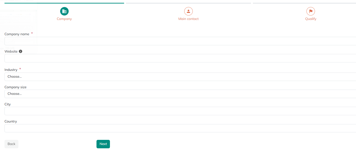
There's no separate form type to choose. Every form has steps - usually just one - and a form becomes multi-step when you add a second step. A form with one step looks and works exactly as before.
Once a form has steps, choose how they're presented: as tabs, a wizard, an accordion, or with no navigation at all. See Choosing a Step Mode.
Adding steps
- Open the form on the Build tab of the Form Builder. On a form with one step, Add step sits beside the title at the top of the Canvas.
- Click Add step. The fields already on the form become Step 1, and an empty Step 2 is added and shown.
- Drag fields into Step 2, and give each step a Label in its settings.
- Save the form.
Adding the second step also:
- shows the step navigation, with Step Mode set to
Tabs; - adds a Header and a Footer around the steps;
- puts three ready-made buttons side by side in the Footer: Back (disabled on the first step), Next (hidden on the last step) and Submit (the Primary button, shown on the last step only). On the last step, Next hides and Submit shows.
If the form already has a Primary button, it's kept instead of a new Submit: the form's buttons move into the Footer, and the Primary button is set to show on the last step only.
These are ordinary buttons. You can restyle, reorder or delete them, and add others beside them.
To add more steps, click Add step at the end of the step navigation. A new step is labeled Step 3, Step 4 and so on, goes after the last step, and is shown. Steps aren't in the field palette - Add step is the only way to add one.

Working with steps on the Canvas
The Canvas shows one step at a time, under the same navigation the user sees. Nothing is validated while you move between steps in the builder.
- Show a step and open its settings: click its tab. Clicking empty space inside a step also opens its settings.
- Rename, duplicate or delete a step: use the step's menu, which offers Settings, Rename, Duplicate and Delete. You can also double-click a step's name to rename it in place.
- Open the navigation settings: click the step navigation (see Navigation settings).
- Move a field to another step: drag the field over that step's tab and hold it there for about half a second. The step opens, and you can drop the field into it.
- Reorder steps: drag a tab, or a wizard step, along the navigation. A bar marks where the step will land. Press Escape, or drop it away from the steps, to cancel. The moved step is shown with its settings open. Add step always stays last. Reordering changes what Next and Back mean, and nothing else.
- Select a field on another step, for example from an error, and the Canvas shows that step.
A step with a visibility or enabled condition is marked in the navigation on the Canvas, so you can see at a glance which steps don't apply to everyone.
In Accordion mode, each step's title sits on top of the step, as the user sees it. Drag the titles up or down to reorder, and use Add step beside the Canvas title. In Custom mode, where the user sees no navigation, the Canvas still draws tabs for you, with the note Only in the builder. In Custom mode, the form moves between steps with its own buttons.
A step sits directly in the form's root container. It holds any fields and containers, including a Section, but it can't go inside another step, a Section, a Repeater or a Dynamic Container. The builder prevents it.
Removing steps
When you delete a step, it's marked for deletion: its tab turns red and is struck through, and you can restore it until you save. Saving deletes the step together with the fields in it, their actions, and the step's On Enter and On Leave. Nothing warns you first.
To make a form a one-step form again, delete steps until one remains. The step navigation goes away. The Header and Footer keep what they hold, and are hidden when empty.
Step Mode
Step Mode sets how the steps are presented and how the user moves between them. Switching between modes never changes the form's content: no step, field, value or setting is lost, and switching back restores what was there. Set it in the Navigation settings, or from the menu beside the Canvas title.
| Step Mode | What the user sees |
|---|---|
Tabs | A strip of named tabs. Every step is reachable at once. |
Wizard | A progress indicator through an ordered sequence, driven by Back and Next. |
Accordion | Step titles stacked vertically, one step open at a time. |
Custom | No navigation. Steps change only through buttons and actions you build. |
The modes also behave differently when the user clicks a step in the navigation:
| Tabs | Wizard | Accordion | |
|---|---|---|---|
| Click a step to move to it | On by default | Off by default | On by default |
| Validation on a click | No | Forward clicks only: the step being left and every step passed over | No |
| On a narrow form | Becomes an accordion | Becomes a progress bar | Stays an accordion |
| Back and Next buttons | Usually not required | Central | Usually not required |
Choosing a Step Mode
Start with one question: does the order matter? If the user should go through the steps in sequence, use a Wizard. If the steps are parts of one thing that can be filled in in any order, use Tabs or Accordion, depending on how much room the form has. Use Custom only when none of them fits the way you want the user to move.
You can change your mind at any time: switching modes keeps everything on the form. Try the form in each mode in the builder before deciding.
Tabs
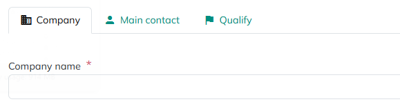
Use it when the steps are parts of one record that the user can fill in or edit in any order, and may come back to. For example, an employee profile with Personal, Address and Bank details, a customer record, or a settings form. Every step is one click away, and the tab titles show what the form holds.
Avoid it when a later step depends on earlier answers, or the user must see every step. A user can skip a tab entirely, and its errors only show when they submit. Tabs also run out of room with many steps or long titles.
Set it up:
- Keep Allow Users To Navigate on, so the tabs can be clicked.
- Back and Next are usually not required: delete them, or keep them for users who prefer to go in order.
- Consider showing Submit on every tab. The ready-made Submit has Last Step Only turned on, which suits a wizard, but in tabs a user who never opens the last tab won't see the button. If you'd rather they could submit from any tab, turn Last Step Only off. If a tab still has errors when the user submits, the form opens that tab and shows them.
- Leave Collapse To Accordion Below at
Medium, so the tabs become an accordion when the form is narrow.
Wizard
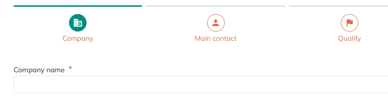
Use it when the order matters: each step builds on the one before, some steps apply only after certain answers, or a step's On Leave does real work, such as checking an account or saving a record before the user goes on. For example, a checkout, a loan or job application, an onboarding flow, or a sign-up. The progress indicator shows how far along the user is and how much is left.
Avoid it when users need to jump straight to one part, for example to edit an address on an existing record. Making them click Next through steps they don't need is frustrating, so use Tabs instead.
Set it up:
- Keep Back and Next. They're how the user moves through a wizard.
- Allow Users To Navigate is off, so the user moves only with the buttons. Turn it on to let users click the steps in the progress indicator. A click back is always allowed, and a click forward validates every step on the way. To let a click leave or pass over a step without validation, turn on that step's Skip Validation. See Clicking steps.
- Use Branching to skip steps that don't apply, and Where Next Goes to jump ahead.
Accordion
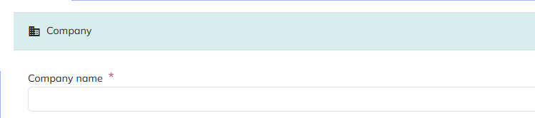
Use it when there are many steps, the step titles are long, or the form has little room: a narrow column, a sidebar, a popup, or a form mostly used on phones. All the titles stay stacked on screen, so the user sees the whole form's shape, and only one step is open at a time.
Avoid it when the order matters. Like Tabs, a click doesn't validate anything, so the user can open any step. On a wide form with a few short steps, Tabs use the space better and still become an accordion on narrow forms.
Set it up:
- Keep Allow Users To Navigate on, so the titles open their steps.
- As with Tabs, Back and Next are optional, and you may want Submit to show on every step by turning off its Last Step Only.
Custom
Use it when you want full control over how the user moves. Custom draws no navigation: the user moves only with the Navigation buttons you place and the Go To Step actions you run. For example, a flow where a server check decides which step comes next, a quiz that shows one question per screen, or a form with its own progress display in the Header.
Avoid it when one of the other modes fits. In Custom mode, you build and maintain every way of moving, and the user gets no sense of where they are unless you add it.
Set it up:
- Make sure every step has a way forward and back. The user has no other way to move.
- Use Where Next Goes, Navigation buttons set to a Specific Step, and the Go To Step action for the routing.
Navigation settings
The settings for the step navigation are on the form's root container, not on the form's Settings tab. They appear once the form has a second step. To open them, click the step navigation on the Canvas. Step Mode is also a menu beside the Canvas title, in place of Add step.
| Setting | Applies to | Default | Description |
|---|---|---|---|
| Step Mode | Every form with steps | Tabs | Tabs, Wizard, Accordion or Custom. See Choosing a Step Mode. |
| Allow Users To Navigate | Tabs, Wizard, Accordion | Off for Wizard, on for the others | When on, the user can click a step in the navigation to move to it. When off, they move only with buttons and actions. See Clicking steps. |
| Collapse To Accordion Below | Tabs | Medium | The form width below which the tabs become an accordion: Medium (below 768px), Wide (below 1200px) or Never. See Small screens. |
| Start On Step | Every form with steps | The first step | The Name of the step the form opens on. Supports Tokens. |
Clicking steps
Allow Users To Navigate decides whether the step navigation can be clicked. When it's off, the navigation only shows where the user is, and only Navigation buttons and Go To Step actions move between steps.
When it's on, whether a click validates depends on the Step Mode:
- Tabs and Accordion move to the clicked step without validation. The user can leave a step that still has errors. Errors are caught when they submit.
- Wizard doesn't validate on a click back. A click forward validates the step being left and every step it passes over, in order. The first step with errors stops the move: the user is taken to that step, its errors are shown, and the focus goes to the first invalid field.
A step's Skip Validation setting lets a wizard click leave or pass over that step without validating it. It's only shown on a wizard's steps while Allow Users To Navigate is on, the only case where it has an effect. Buttons ignore it and follow their own Validation Scope.
Start On Step
The form opens on the first step by default. Set Start On Step to open on another one, for example to send returning users straight to a Review step. Because it supports Tokens, the step can come from the page address: [QueryString:Step] opens the step named in the URL's Step parameter.
If the step can't be shown to this user, or doesn't exist, the form starts on the first step that can. When Auto Save Drafts brings back a draft, the form opens on the draft's step instead.
Step settings
Click a step's tab to open its settings.
| Setting | Description |
|---|---|
| Label, Name | The step's title in the navigation, and the Name other settings use to refer to it. See General. |
| Step Icon | Optional. The name of a Material icon, for example person or home. It shows before the title in tabs, and in place of the step number in a wizard. |
| Skip Validation | Shown in Wizard mode with Allow Users To Navigate on. Lets a click in the navigation leave or pass over this step without validating it. See Clicking steps. |
| Active, visibility and enabled settings | The same as for any field - see Active, Visibility settings and Enabled settings. See Branching for how they affect moving between steps. |
| Where Next Goes | The step that Next goes to from this step, picked from the other steps. Turn on its Expression switch to build the step's Name from Tokens instead. Leave it empty to go to the next step in order. |
| On Enter, On Leave | Action lists, built with Add Action, Import Action and Paste. See What happens during a move. |
| Layout Mode and the other layout settings | The same as for a Layout Container, and set per form width - see Layouting. |
| Step CSS Classes | Classes added to the step, for your own CSS. |
Header and Footer
A form with steps has a Header above the steps and a Footer below them. Their fields show on every step: for example, a title or reference number in the Header, and the form's buttons in the Footer. The Header sits above the step navigation.
- On the Canvas, they're dashed frames labeled Header and Footer, with the hints
Fields here show above every step, and above the step navigation.andFields here show below every step. - Each has the same layout settings as a Layout Container. The Footer added with the second step is
Horizontal. - An empty Header or Footer takes no room on the live form.
- While the form has steps, every field sits in the Header, a step or the Footer. The Header and Footer can't be deleted or cloned, and they aren't in the field palette.
Keeping the Header or Footer in view
On a long step, the buttons in the Footer can scroll out of sight. Stay Visible When Scrolling keeps the Header at the top of the screen, or the Footer at the bottom, while the rest of the form scrolls.
| Setting | Description |
|---|---|
| Stay Visible When Scrolling | Off by default, and on for the Footer added with the second step. |
| Offset | A distance in pixels, so a pinned Header or Footer clears your site's own fixed menu bar. |
- In
Tabsmode, a pinned Header takes the tabs with it. - When the form opens in a popup or slide-in panel, the Footer moves into the panel's own footer bar, and this setting has no effect. The Header stays with the form's content, below the panel's title bar.
- On small screens where a pinned area would cover the field being typed in, it stops being pinned.
- If the page's layout makes pinning impossible, the builder warns you.
Moving between steps
Navigation buttons
Back and Next are Navigation buttons. Navigation is a Button Type offered on forms with two or more steps. A Navigation button moves to a step and doesn't submit the form. You can add more of them anywhere on the form, for example a "Skip to the end" button.
| Setting | Description |
|---|---|
| Go To | Next (the default) or Previous: the next or previous step the user can actually reach. Hidden and disabled steps are skipped. First or Last: the first or last step the user can reach. Specific Step: a step you choose by name. |
| Step | For Specific Step, the step to go to, picked from a dropdown of the form's steps. Turn on its Expression switch to build the step's Name from Tokens instead. |
| When There Is Nowhere To Go | The button disables itself when its target doesn't resolve: Previous on the first step, Next on the last, or a specific step that's hidden for this user. Set it to Hide to hide the button instead. No condition is needed. |
| Validation Scope | Active Step (the default): the fields on the step being left must pass before the user moves. None: nothing is validated, and the user moves even with errors. The ready-made Next uses Active Step, and Back uses None. |
| On Click Handler | Actions that run after the step's validation and before the step's On Leave. |
A Previous button you add yourself starts on Active Step, so it validates the step on the way back until you set it to None.
Other buttons on a form with steps
- Last Step Only shows a button on the last step only. The ready-made Submit uses it.
- On a Regular button, Validation Scope also offers
Active Step: only the fields on the step the user is on when they press the button are validated. If the form goes back to one step, a button set toActive Stepfalls back to its type's default scope, and the builder shows the change. - The form still allows only one Primary button, even across steps.
Go To Step action
The Go To Step action shows a step once the actions in its list finish. Pick the step from the form's steps. Use it when an action decides where the user goes, for example after a server call or inside a condition. It doesn't validate the step being left and doesn't run its On Leave, but the new step's On Enter runs. It does nothing if the user can't reach the step. It isn't offered in the form's loading events.
What happens during a move
When the user moves with a Navigation button or by clicking the navigation, the move runs in this order:
- The step being left is validated - as the button's Validation Scope says, or for a click, as described in Clicking steps.
- The button's On Click Handler runs, if a button started the move.
- The step's On Leave runs.
- The new step is shown.
- The new step's On Enter runs, while the step is already on screen.
Any of the first four stages can stop the move, and the user then stays where they are. When validation fails, the step is marked as having errors, and the focus moves to the first invalid field on it.
On Leave and On Enter run on the server. On Leave can do real work - save a record, call an API, check something on the server - and the move stops if its actions fail, redirect, or go to another step. Before On Leave runs, the server validates the step being left again.
On Leave runs only when the user moves with a Navigation button or a click. On Enter runs whenever a step comes to show: after a move, when the form opens, after a Go To Step action, when the user's step stops applying, and when a draft brings the user back to a step. Each time the user comes back to a step, its On Enter runs again, but it writes only into fields the user hasn't edited. Anything they typed is kept.
A move with no actions at all - on the button, in On Leave and in On Enter - is instant and doesn't contact the server. A move with actions waits for them: the form's buttons are disabled meanwhile, and no other move can start.
After Back or Next, the focus goes to the first field of the new step: the field at the top left (top right on a right-to-left form), skipping buttons, content blocks, and hidden or disabled fields. The field isn't opened - a dropdown gets the focus but stays closed. If the step has no such field, the step itself gets the focus. On a touch screen, the step itself always gets the focus, so the on-screen keyboard doesn't open. A click on the navigation keeps the focus on the step clicked.
Submitting
The Primary button validates the whole form, as on any form. If any step has an error, the user is taken to the first step with an error, and the focus goes to its first invalid field. Nothing runs on the way - no On Leave and no On Enter.
A step with an error is marked in the navigation and on the step itself, with an icon as well as a color, so an error two steps back is never hidden. The mark stays until the errors are fixed. A step with no fields always passes.
Pressing Enter in a field never moves between steps. It presses the Primary button only when the user can see it, as on a one-step form.
Branching
A step can be inactive, hidden, or disabled for some users, with the same settings fields use. For example, a "Company details" step can show only when an earlier answer is "Business".
- A step that's hidden for this user isn't in the navigation. It takes its place in the navigation as soon as it shows. A disabled step keeps its place, greyed out, and can't be clicked.
- Next and Back skip a step that's hidden or disabled for this user, so a branching form needs no extra setup.
- Where Next Goes on a step sends Next to a step of your choice, so a flow can jump ahead, jump back, or converge from several places. If that step can't be shown, Next goes to the next reachable step in order.
- Back goes to the previous reachable step in the form's order, not back along the path the user took. After a Where Next Goes jump, Back can land on a step the user skipped.
- If the step the user is on stops applying, for example because they changed an earlier answer, they move to the nearest step that applies - forward first, then back - without validation.
- Validation covers only the steps the user can reach when it runs. A step that appears later shows no errors until it's validated - for example by Next on that step, or by Submit - however the user gets to it.
Small screens
- In
Tabsmode, the tabs become an accordion when the form is narrower than Collapse To Accordion Below. This is measured on the form's own width, as per-width layouts are, so a form in a narrow column or a popup collapses even on a wide screen. Only the presentation changes: the steps and the rules for moving between them stay the same. Use the width buttons on the Canvas to preview it. - A wizard never becomes an accordion. When the form is narrower than 768px, its progress indicator becomes a bar with one segment per step, with the position and title of the current step below it, for example
Step 2 of 4 · Address. Each segment shows its step's state and errors, and clicking one works like clicking the step. The Canvas always shows the full progress indicator.
Drafts
When Enable Auto Save Drafts is on (see Autosave and Drafts), the draft also remembers the step the user was on. When they come back, the form opens on that step, or on the first step that applies if that one no longer does.
Keyboard and screen readers
- Only the step showing can be reached with the keyboard. Fields on the other steps can't get the focus.
- In
Tabsmode, the arrow keys move between tabs, and Home and End jump to the first and last tab. - Moving to a step is announced by its title and position, for example "Address, step 2 of 3".
- When validation finds errors, the number of errors and the first step with one are announced, for example "3 errors. First error on step 1, Details."
Things to keep in mind
- Existing forms don't change. Every existing form is a one-step form, and it looks and works as before until you add a second step.
- Field names don't change. A step doesn't add its name to its fields' names:
[Email]stays[Email]on any step, in the Header, or in the Footer. A step also has a value of its own, a JSON object of its fields' values, in the token[StepName], using the step's Name. - Steps that aren't showing keep their values. Their fields stay in the form, out of sight.
- Renaming a step updates the settings that name it, such as Start On Step, Where Next Goes, a Navigation button's Step, and the Go To Step action. Your own CSS that targets the step by name isn't updated, and the builder reminds you. A Navigation button whose step was deleted is disabled on the live form and reported when you save, and a Go To Step action that names it does nothing.
- Step titles are translated like other field labels, and so are the labels of the ready-made buttons. See Localization.
- Colors follow the skin. The step navigation uses the skin's primary color.
- Classic Action Forms arrive as one step. A form migrated from the classic Form module (see Migration from Action Form) is a one-step form. Multi-step setups built with TabsPro tabs aren't converted into steps - add the steps in the Form Builder.
Related
- Button - button types and settings
- Common Field Settings - active, visibility and enabled settings, also used by steps
- Layouting - layout modes for steps, the Header and the Footer
- Canvas - arranging fields and previewing widths
- Settings - Auto Save Drafts
Last updated: November 19, 2026