Forms 2.0 - Common Field Settings
This page is preliminary and subject to change as Forms 2.0 continues to be developed.
In addition to its own specific parameters, most fields in the Forms 2.0 Form Builder share a common set of settings. Which of these sections actually appear for a given field type depends on that field type - each field's own documentation page notes which of these apply to it.
General
Shown for every field:
| Setting | Description |
|---|---|
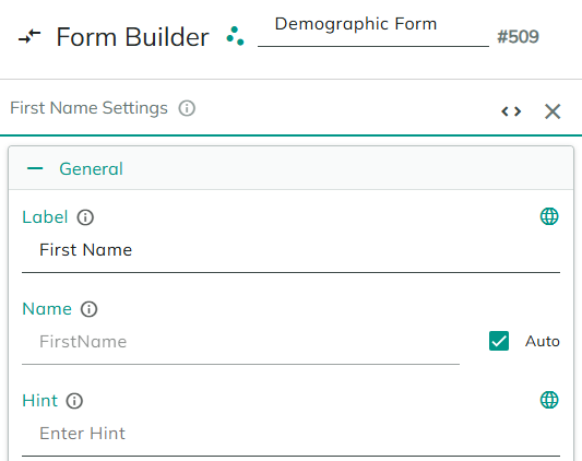
| Label | The text displayed on the front end, next to or above the field - the field's external, user-facing name. |
| Name | The field's internal identifier, used to reference it elsewhere - for example, in tokens, using [Name] syntax. Check Auto to have this derived automatically from the Label, or uncheck it to set your own. |
| Hint | Help text displayed near the field on the front end. Only available for field types that support it. |
Label is what the person filling out the form sees; Name is what you and the form's actions/tokens use to refer to the field behind the scenes, and doesn't need to match the Label. Changing the Label later doesn't affect the Name (unless Auto is checked), so existing tokens keep working.
Once Localization is enabled for the form, a small globe icon appears next to Label and Hint (the two localizable parts of a field's General settings - Name is never localized, since it's an internal identifier). Hovering over it shows whether that text is translated in every site language, or lists which languages are still missing a translation.
Active
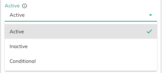
Shown for every field. Controls whether the field exists in the form at all:
- Active - the field is always part of the form.
- Inactive - the field is removed from the form entirely.
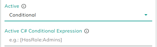
- Conditional - reveals an Active C# Conditional Expression field, a server-side expression evaluated when the form loads to decide whether the field is active (for example
[HasRole:Admins]).
Visibility settings
Only available for field types that support it. Controls whether the field is shown or hidden, separately from whether it's Active (an inactive field doesn't exist at all; a hidden field still exists, it's just not shown):
| Setting | Description |
|---|---|
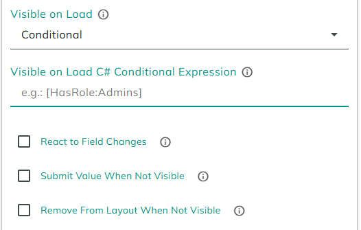
| Visible on Load | Visible, Not Visible, or Conditional. Choosing Conditional reveals a Visible on Load C# Conditional Expression field, a server-side expression evaluated when the form loads (for example [HasRole:Admins]). |
| React to Field Changes | When checked, unlocks a Reactive Visibility Rule - a client-side JavaScript boolean expression (for example fields.Country.value === "United States") that's re-evaluated whenever other fields change. |
| Submit Value When Not Visible | Only shown for fields that support binding a value (see Field Automations). When checked, the field's value is still submitted even while it's not visible. |
| Remove From Layout When Not Visible | When checked, hiding the field also collapses the space it would otherwise take up in the layout. |
Enabled settings
Only available for field types that support it. Controls whether the field can be interacted with:
| Setting | Description |
|---|---|
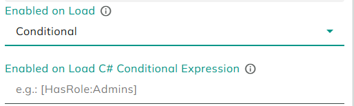
| Enabled on Load | Enabled, Disabled, or Conditional. Choosing Conditional reveals an Enabled on Load C# Conditional Expression field, a server-side expression evaluated when the form loads (for example [HasRole:Admins]). |
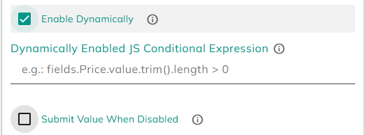
| Enable Dynamically | When checked, reveals a Dynamically Enabled JS Conditional Expression field - a client-side JavaScript boolean expression (for example fields.Price.value.trim().length > 0), re-evaluated whenever other fields change. |
| Submit Value When Disabled | Only shown for fields that support binding a value (see Field Automations). When checked, the field's value is still submitted even while it's disabled. |
Field Automations
Only available for field types that support binding. Depending on the field type, one or more of the following are available:
| Setting | Description |
|---|---|
| Value | A client-side JavaScript expression that sets the field's value (for example fields.Price.value * 3). |
| On Change | A client-side JavaScript snippet, written in a code editor, that runs whenever the field's value changes. |
| On Click | A client-side JavaScript snippet, written in a code editor, that runs when the field is clicked. |
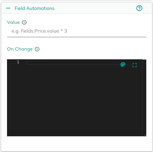
These expressions and snippets run entirely client-side. Only client-side tokens are available here - server-side tokens and Configuration Tokens cannot be used.
Field Validators
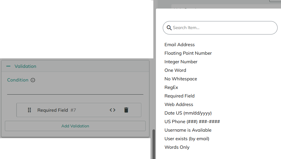
Only available for field types that support binding a value. This panel (labeled Validation) lets you attach one or more validators to the field via Add Validation, plus an optional Condition expression that controls when the attached validators apply at all. Each attached validator can be expanded, reordered, or removed, and every validator has its own customizable Message shown to the user when it fails.
The available validators are:
| Validator | Checks that the value... |
|---|---|
| Required Field | isn't empty. |
| Email Address | is a valid email address. |
| Web Address | is a valid URL. |
| Integer Number | is a whole number. |
| Floating Point Number | is a number, optionally with decimals. |
| US Phone (###) ###-#### | matches the US phone number format. |
| Date US (mm/dd/yyyy) | matches the US date format. |
| One Word | contains only a single word (letters only, no spaces or numbers). |
| Words Only | contains only letters, numbers, and spaces. |
| No Whitespace | contains no spaces. |
| RegEx | matches a regular expression you provide. |
| Username is Available | isn't already taken by an existing user. |
| User exists (by email) | matches an existing user's email address. |
Data Source
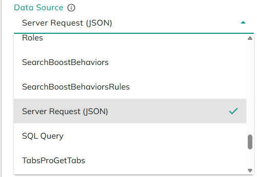
Only available for field types that let the user pick from a list of options - currently Dropdown, with more field types planned to support it over time. A Data Source is a pluggable way to supply that list, so the same set of options can come from different places depending on the Data Source type you pick.
The full Data Source list is not fixed - it's assembled from every data source configured on the site, including ones added by other modules and extensions, so what you see can vary from site to site and grows as more are added. A few are especially relevant to forms:
| Data Source | Provides options from... |
|---|---|
| Items List | A static list you type in directly, one item per line. Use a pipe (|) to give an item a different display text and stored value (for example Second Item|WithDifferentValue). Supports Tokens. |
| Entity Records | Records from one of your site's Entities, with settings for which Entity, how many to return, search text, sorting, and an optional Where Clause to filter results. |
| SQL Query | The results of a SQL query you provide, optionally against a specific connection string. Requires the Data Integration feature. |
| Server Request (JSON) | The response of an external API call (GET or POST) that returns JSON - you point it at the response's relevant properties for the option text, value, and (for linked dropdowns) path. Requires the Data Integration feature. |
Beyond these, a number of built-in reference lists are also available as Data Sources wherever a list of options is needed - for example Country, Currency, Region, Roles, and Time Zone.