Forms 2.0 - Password
caution
This page is preliminary and subject to change as Forms 2.0 continues to be developed.
A password field, with its input masked as the user types.
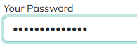
Adding a Password field
Drag the Password tile from the field palette onto the Canvas - see Build for more on adding and arranging fields in general.
Parameters
Only Password-specific parameters are listed below. See Common Field Settings for the settings shared with other field types.
| Field | Description |
|---|---|
| Confirmation Of | If this field is a "confirm password" field, select the other Password field it should confirm. |
| Has Value | Controls the field's initial "already set" state - provide a Token expression that resolves to true or false (for example, whether the bound record already has a password). When true, the field renders as already set, and the user can leave it blank to keep the existing value. |
| Display Show/Hide Password Control | When enabled, the user can toggle the password masking on and off. |
| Show Last Added Character | When enabled, briefly unmasks the most recently typed character. |
| Root CSS Classes | One or more CSS class names, separated by spaces, applied to the field's root element only. Supports Tokens. |
| Custom Attributes | Name/value pairs inserted as HTML attributes on the field's <input> tag, for use by JavaScript or CSS. Supports Tokens. |
Common settings that apply to Password
A Password field supports these Common Field Settings:
- General (Label, Name, and Hint)
- Active
- Visibility settings
- Enabled settings
- Field Automations - Value and On Change (Password does not support On Click)
- Field Validators
Tokens
A Password field returns its current value as a token, referenced using the field's Name - for example, if the field's Name is Password, use [Password] elsewhere in the form or its actions to get the text the user entered.